
Comparative Insight: Why read channel-letter practice for signage with tactile elements
Channel letters teach a lesson: structural design and finish determine how long an exterior sign lasts. This piece compares material choices, attachment methods, and durability protocols used for illuminated channel letters to those suitable for ada braille signs, arguing that the same engineering logic—wind load analysis, corrosion allowances, and controlled tolerances—applies to tactile signage on façades and wayfinding panels. The approach is practical and technical, not speculative. It starts with the trade-offs visible on projects in city cores where standards like the ADA 2010 Standards for Accessible Design intersect with real wind-exposure cases such as coastal storefronts and transit hubs.
Material trade-offs: aluminum, acrylic, stainless, and polycarbonate
Aluminum provides low weight and high corrosion resistance when properly anodized; it is common for channel-letter backers and works well for tactile nameplates where weight and thermal expansion matter. Acrylic offers clean edges for tactile legends but requires UV stabilization to avoid crazing under sun exposure. Stainless steel resists corrosion and mechanical abrasion but increases mass, which raises demand on fasteners and substrate. Polycarbonate resists impact but can yellow if unprotected. Each choice affects material fatigue, wind load response, and the need for secondary coatings such as fluoropolymer paints or anodizing.
Mounting systems and wind-load logic
Mounting strategy is the single largest determinant of field performance. Standoff mounting with isolated anchors reduces substrate stresses; continuous backer mounting distributes wind pressures across the facade. For channel letters, mounting slots, heim nuts, and threaded studs are sized to resist calculated wind load; the same method applies to large tactile panels carrying braille: select anchor shear and pullout capacities with a safety factor. Specifying the correct substrate—masonry vs. metal stud—matters. Use shear-rated anchors for façades exposed to prevailing winds and consider gasketed interfaces to prevent water ingress and galvanic corrosion.
Testing, inspection, and winter-to-summer cycles
Longevity is not only material selection but inspection discipline. Fatigue from thermal cycling, UV-induced embrittlement, and chloride-driven corrosion on coastal sites appear after seasons, not months. Implement a simple inspection protocol: anchor torque check at one year, surface finish assessment at two years, and touch tests for tactile elements at five years. Calibration of expectations must consider common failure modes—seal failures at seams, bolt loosening, and adhesive creep on die-cut acrylic—so plan maintenance intervals accordingly. —These small interventions often prevent costly reworks.
Design considerations specific to tactile signage
Tactile signage needs readable braille domes, minimum letter heights, and consistent mounting height compliance. Material edges near braille require tight dimensional control; manufacturing methods such as CNC routing or die-cut acrylic produce different edge tolerances. Bonding methods that work for illuminated channel letters (mechanical fasteners plus silicone seals) often translate well to exterior tactile panels. For custom applications, integrate the sign’s structural frame with the tactile face to reduce cantilever loads. Learn from illuminated sign practice: redundant attachment points and clear maintenance access extend service life.
Common mistakes and alternatives
Typical errors: underestimating wind load on large panels; selecting acrylic without UV grade for sun-facing façades; using incompatible metals that induce galvanic corrosion. Alternatives include laminated composite substrates with corrosion-resistant skins, or stainless inserts at anchor points to reduce localized corrosion. Where weight is a primary constraint, use ribbed aluminum backers with thicker edge profiles to keep stiffness high without adding mass.
Advisory: three golden rules for selecting and evaluating exterior tactile signs
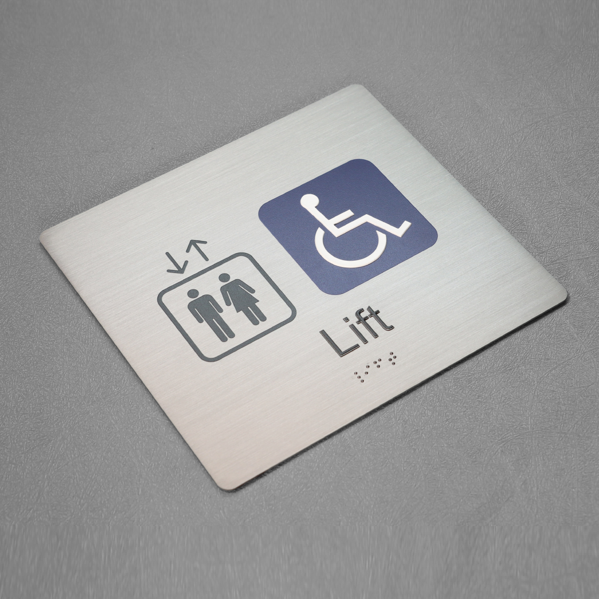
1) Structural adequacy: ensure anchor selection and mounting method are sized to the site-specific wind load with at least a 2× safety factor; verify substrate capacity. 2) Material compatibility: choose finishes and substrates that prevent galvanic couples and that include UV and chemical stabilization for the installation environment. 3) Maintenance clarity: specify inspection intervals and accessible fasteners so routine checks—anchor torque, seal integrity, tactile legibility—are straightforward for facilities teams. For tailored production and certified braille compliance, consider custom ada braille signs that combine tested substrates with documented attachment systems.
Concrete results come when design, material science, and on-site anchorage align; that alignment is what reduces call-backs on busy streets like those around transit hubs and municipal buildings. Practical, checked solutions are what last—just as reliable as the best channel-letter work — Cosun Sign.